
What Is UX Writing for Apps and Websites?
UX writing for apps and websites is the process of creating clear, useful and user-focused content that guides people through digital experiences. It includes everything from website navigation labels and landing page buttons to app onboarding instructions, form descriptions, error messages and confirmation notifications.
In UI/UX design, UX writing is an important part of creating interfaces that people can understand and interact with easily. Designers use words to communicate actions, explain features, provide feedback and guide users through different stages of a digital product.
For example, on an e-commerce website, a button labelled Add to Cart clearly tells users what happens when they select it. Similarly, a message such as Your payment was successful confirms that a transaction is complete.
These words are not just decorative elements within an interface. They influence how users understand a screen, respond to an action and move towards their goals. Even a well-designed interface can become difficult to use when its instructions, labels and messages are unclear.
This guide explores UX writing principles, practical examples, useful tools and ways UI/UX designers can use better interface content to create meaningful digital experiences.
Why Is UX Writing Important for Apps and Websites?
UX writing makes digital products easier to understand and use by providing the right information at the right moment.
An attractive website or feature-rich application can still frustrate users when its instructions, buttons and messages are unclear. This is why designers need to consider content alongside layouts, colours, typography and interactive elements.
Here are five ways effective UX writing improves interface design:
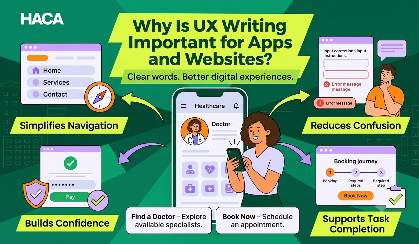
Simplifies navigation: Clear labels help users find pages, features and information without unnecessary effort.
Reduces confusion: Helpful instructions explain what users need to do and what happens next.
Builds user confidence: Transparent messages help people understand payments, registrations and other important actions.
Improves usability: Meaningful content makes forms, buttons and interactions easier to understand.
Supports task completion: Relevant messages guide users through bookings, registrations and purchases.
For example, a healthcare website may use the button Book Now to help visitors schedule an appointment. However, a button labelled Find a Doctor may be more appropriate when the next step involves exploring available specialists.
[ Note: The right wording depends on the user's immediate goal.]
What Are the Main Elements of UX Writing on Websites and Apps?
UX writing appears in different parts of a digital product. Each element communicates information and helps users complete a specific action.
For UI/UX designers, understanding these elements is important when creating wireframes, designing interface components and planning user journeys.
1. Website navigation and menus
Navigation labels help visitors understand a website's structure and find relevant information.
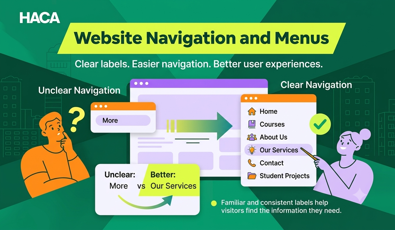
For example:
Unclear: “More”
Better: “Our Services”
Similarly, labels such as Courses, About Us, Contact and Student Projects communicate the destination more clearly than creative but unfamiliar alternatives.
Good navigation writing uses familiar terminology and keeps labels consistent across the website.
2. Landing page headings and CTAs
Landing pages introduce a product, service or offer. Their content should explain what visitors can expect and guide them towards relevant actions.

For example:
Unclear heading: “Discover a World of Possibilities”
Better heading: “Learn Practical UI/UX Design Skills Through Real Projects”
The second heading communicates the actual offering.
In the case of CTAs, CTA buttons should also describe the action clearly. Designers should consider the wording, placement and visual hierarchy of CTAs when planning an interface. A button should make its purpose clear and help users understand what will happen after they select it.
Unclear CTA | Better CTA |
Click here | Explore courses |
Know more | View course details |
Submit | Send enquiry |
Get started | Create your account |
3. App onboarding screens
Onboarding introduces new users to an application, its features and its benefits.
For example:
Unclear: Welcome to your new experience!
Better: Track your expenses and manage your monthly budget in one place.
The second message explains what users can achieve with the application.
When designing onboarding screens, focus on the information users need to understand before interacting with the application. Avoid lengthy introductions and guide users towards the features that matter most.
4. Forms and input fields
Forms collect information on websites and apps, from contact details to account registrations and payment information.
Useful labels and instructions reduce uncertainty.
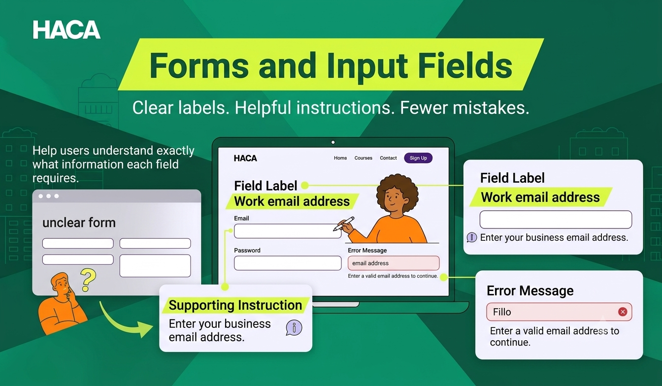
For example:
Label: Work email address
Supporting text: Enter your business email address.
Error message: Enter a valid email address to continue.
Avoid making users guess what information a field requires.
5. Error and success messages
Error messages explain what went wrong and how users can resolve the issue. Success messages confirm that an action is complete.
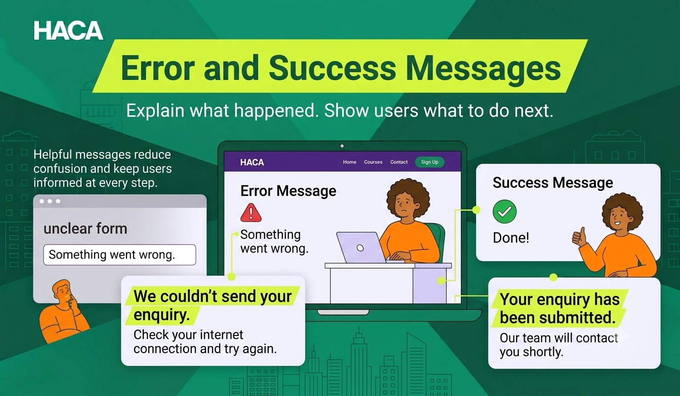
Unclear error: “Something went wrong.”
Better error: “We couldn't send your enquiry. Check your internet connection and try again.”
Unclear success: “Done!”
Better success: “Your enquiry has been submitted. Our team will contact you shortly.”
The message should explain the situation and provide a useful next step. Designers should also consider where these messages appear. An error message should be close to the relevant field or action, while a success message should be visible enough to confirm that the user's task is complete.
6. Empty states and notifications
An empty state appears when a page or screen has no content to display. Instead of showing a blank screen, provide a short explanation and an action.
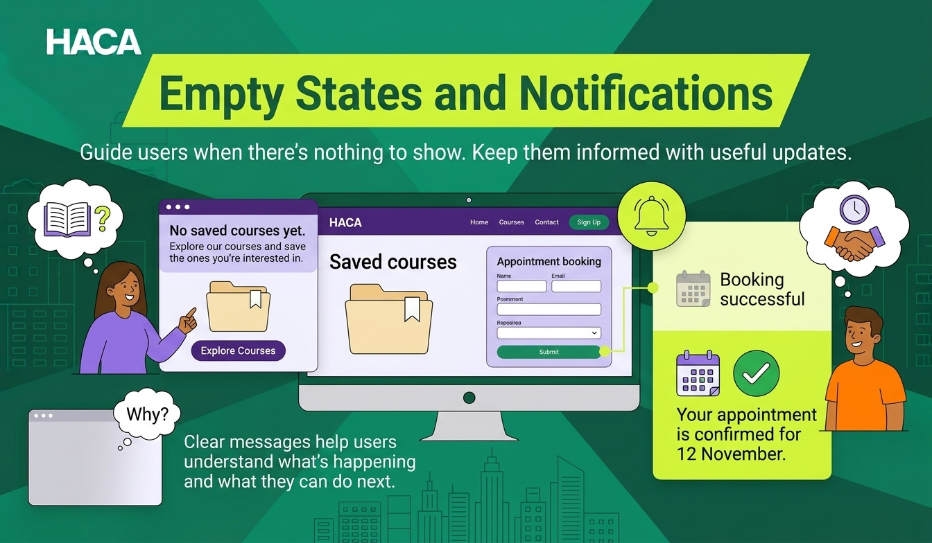
Example:
No saved courses yet.
Explore our courses and save the ones you're interested in.
Notifications should also communicate relevant information without overwhelming users.
For example, an appointment booking website can send Your appointment is confirmed for 12 November instead of a generic Booking successful message.
What Are the Best UX Writing Principles?
Effective UX writing follows a few fundamental principles that make digital interactions easier and more predictable.
UI/UX designers can use these principles when choosing interface labels, writing button text and creating content for different screen states.
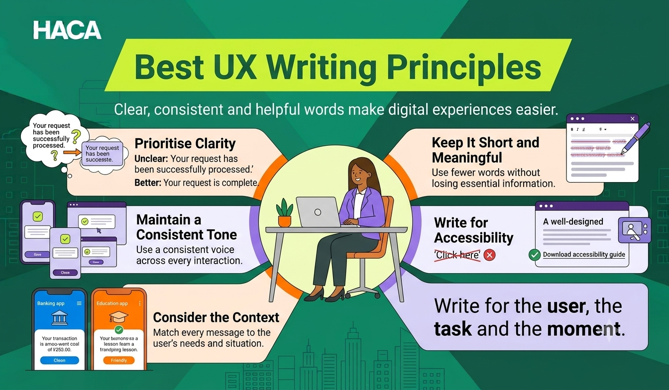
1. Prioritise clarity over creativity
Users should understand a message without reading it several times. Avoid complicated phrases, technical terminology and unnecessary expressions.
For example:
Instead of “Your request has been successfully processed”, write “Your request is complete.”
The second version communicates the same information more directly.
When designing an interface, choose familiar words that users can understand immediately. Creative language should never make an important action difficult to recognise.
2. Keep content short and meaningful
Website visitors and app users should be able to find important information quickly.
Remove unnecessary words without removing essential context.
However, short does not always mean better. A slightly longer instruction can be more helpful when it explains an important action.
This is particularly important in mobile app design, where screen space is limited. Designers should balance content length with readability instead of removing information users need to complete a task.
3. Maintain a consistent tone of voice
An app or website should communicate consistently across its pages and interactions.
For example, a brand that uses friendly language on its homepage should maintain a similar tone in its registration messages, notifications and error screens.
A content style guide can help teams maintain consistency in:
Terminology
Button labels
Capitalisation
Voice and tone
Error messages
Inclusive language
4. Write for accessibility
Digital content should be understandable and usable by people with different abilities and needs. Use descriptive links, meaningful labels, plain language and clear instructions.
For example, a link labelled Download accessibility guide is more informative than Click here.
Do not rely only on colours or visual indicators to communicate important information.
5. Consider the context of every message
The same message may not work in every situation.
For example, a payment application and an educational website have different audiences, goals and communication requirements.
A banking app needs precise transaction information, while an educational website may need simple course descriptions and clear enrolment instructions.
Write according to what the user needs at that particular moment.
How Does UX Writing Differ Between Apps and Websites?
Although both use similar UX writing principles, their content requirements can differ based on the platform and user journey.

UX writing for websites | UX writing for apps |
Website navigation and page labels | App menus and screen labels |
Landing page headings and CTAs | Onboarding instructions |
Contact and enquiry forms | Registration and verification forms |
Product descriptions and checkout messages | Payment and transaction messages |
Website error and confirmation messages | In-app notifications and empty states |
Breadcrumbs and search instructions | Contextual prompts and permission requests |
For example, an e-commerce website may need clear product information, delivery details and return policies before someone makes a purchase.
Its mobile application may also need short, contextual messages that guide users through account verification, saved addresses and payment confirmation.
The difference becomes more important when designers adapt the same digital product for desktop and mobile screens. Content that works well on a large website layout may need to be simplified or reorganised for a smaller mobile interface.
The platform changes, but the underlying objective remains the same i.e. to help users complete their tasks with confidence.
How Can You Create Effective UX Content for Apps and Websites?
UX writing involves research, planning, collaboration and testing. It should be part of the design process rather than an activity that begins after the interface is complete.
UI/UX designers can follow the given below structured workflow to make sure interface content supports both the user's needs and the product's functionality.

Step 1: Understand your users
Identify the target audience, their expectations and the problems they want to solve.
Use interviews, surveys, website feedback, customer support queries and usability research to understand their needs.
Creating effective interface content starts with understanding the people who will use the product. Developing a user persona helps UI/UX designers identify their target audience, understand their goals and challenges, and make design decisions based on user needs.
Step 2: Map the user journey
Identify the steps people take to complete important tasks.
For example, an online course website may have this journey:
Visit the homepage.
Explore available courses.
Read the course details.
Submit an enquiry.
Speak with an admissions representative.
Complete the enrolment process.
Identify what information users need at each stage. A user journey map helps designers understand where instructions, buttons, supporting messages and confirmations are necessary. It also highlights areas where unclear content may interrupt the experience.
Step 3: Create the interface content
Write headings, navigation labels, button text, form instructions, notifications and other interface messages.
Prioritise the user's immediate needs and avoid unnecessary information.
Start adding realistic content while creating wireframes instead of relying entirely on placeholder text such as Lorem Ipsum. Actual content helps designers understand how much space each element requires and whether the layout supports the intended message.
Step 4: Collaborate with designers and developers
UX writers work with UI/UX designers, product managers and developers to make sure the content fits the actual interface.
Consider screen sizes, layout limitations, responsive behaviour and character limits.
For example, a button label that fits comfortably in a desktop design may become difficult to accommodate on a smaller mobile screen. Reviewing content during the design process helps teams identify these issues before development.
Step 5: Test and improve the content
Use usability testing, user feedback and analytics to identify confusing content.
A/B testing can help compare different versions of a CTA, heading or form instruction.
For example, compare two registration button labels to understand which one helps more users complete the intended action.
Designers should observe how users interact with the interface, identify where they hesitate or make mistakes and improve the content accordingly.
Which Tools Do UX Writers Use?
UX writers use different tools to create, organise, review and test interface content.
Tool | Purpose |
Figma | Write and review content within interface designs |
FigJam | Map user journeys and organise ideas |
Notion | Maintain content guidelines and documentation |
Google Docs | Draft and review content |
Maze | Conduct usability and prototype testing |
Grammarly | Review grammar and readability |
Figma is particularly useful because designers can see how their words appear within actual website and app layouts. They can review button labels, form instructions, headings and other interface content while working on wireframes and prototypes.
This helps identify content that feels too long, unclear or disconnected from the user's task.
What Is the Difference Between UX Writing and Copywriting?
UX writing and copywriting both use language to influence how people interact with a brand. However, their primary objectives are different.
UX writing | Copywriting |
Guides people through digital experiences | Persuades audiences through marketing content |
Focuses on usability and task completion | Focuses on interest, engagement and conversions |
Appears in menus, buttons, forms and messages | Appears in advertisements, landing pages and campaigns |
Uses contextual and action-oriented language | Uses persuasive and brand-focused language |
For example, a website's marketing copy may encourage visitors to explore a new product.
UX writing helps them understand its features, select an option, complete a form and finish the purchase.
Both disciplines support the customer journey, but they solve different communication problems.
Why Should UI/UX Designers Learn UX Writing?
Learning UX writing helps UI/UX designers look beyond the visual appearance of a digital product and understand how people interact with its content.
A well-designed interface needs more than attractive layouts, colours and typography. Users also need clear instructions, meaningful labels and helpful feedback to complete their tasks.
UX writing is one part of the broader UX design process. Understanding how user research, information architecture and usability work together helps designers create interfaces that are both visually appealing and easy to use.
Here are six reasons designers should understand UX writing:

Create intuitive interfaces: Choose words that help users understand navigation, buttons and interactive elements.
Improve usability: Make forms, instructions and other interface components easier to understand.
Reduce user frustration: Identify unclear messages that may interrupt important interactions.
Design better user journeys: Provide relevant information at every stage of the user's interaction.
Improve accessibility: Create content that supports different user needs and abilities.
Collaborate effectively: Communicate design decisions more clearly with developers, product managers and content teams.
UX writing and UI/UX design complement each other. Understanding both helps designers consider not only how an interface looks but also how it communicates and functions.
How Can Businesses Improve Their Digital Experiences Through UX Writing?
Businesses should treat interface content as an important part of website and application development.
Start by reviewing the pages and screens where users frequently abandon tasks, contact customer support or make mistakes.
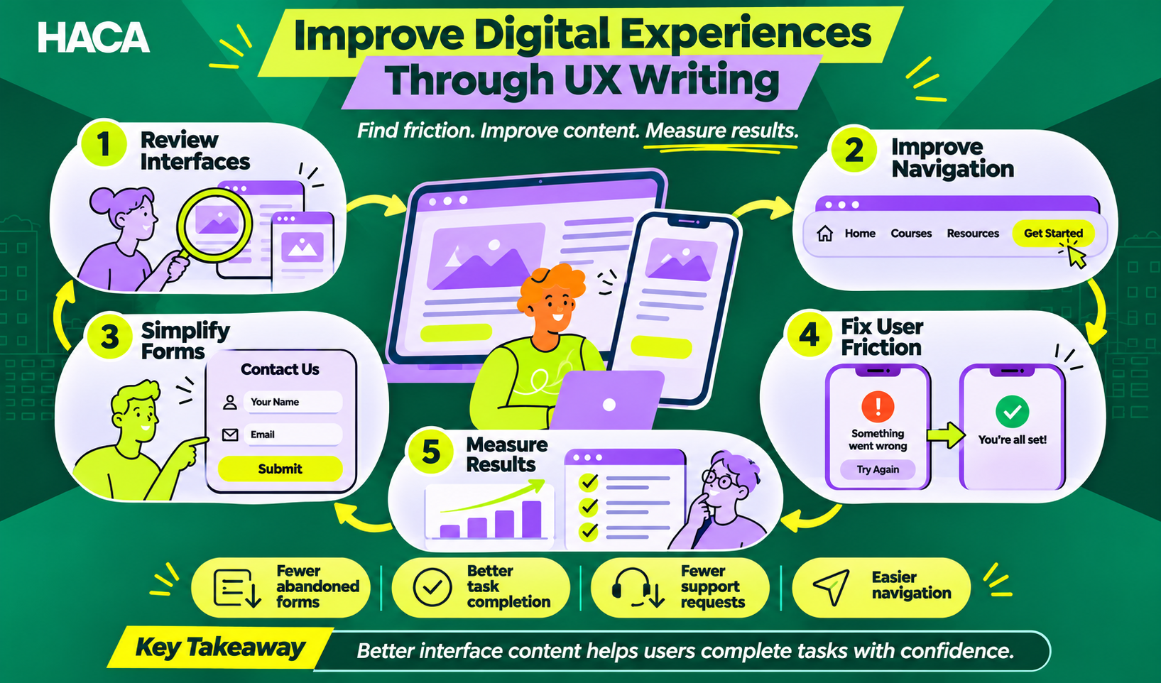
Pay particular attention to:
Website navigation and landing page CTAs
Contact and registration forms
Product pages and checkout flows
App onboarding and account verification
Payment and booking confirmations
Error messages and empty states
For example, if visitors frequently abandon an enquiry form, review its field labels, instructions and error messages.
Check whether the form asks for unnecessary information or whether users understand what happens after submission.
Track relevant measures such as form completion, task success, page abandonment and support requests.
This helps businesses make informed content improvements instead of relying only on personal opinions.
Final Thoughts
Creating better digital experiences involves more than writing clear messages or designing attractive screens.
UX writing brings this clarity to every interaction, from a website's homepage navigation to an app's final confirmation message. Both UX writing and UI/UX design play an important role in making websites and applications easier to use.
If you enjoy working with words, understanding user behaviour and creating meaningful content, UX writing is a skill worth exploring. If you want to go beyond words and learn how to plan, design and build user-friendly digital experiences, UI/UX design could be the right career path for you.
Want to explore a career in UI/UX design? Enrol in the UI/UX Design Course in Calicut at HACA Design School to learn design principles, understand user needs and develop practical skills through hands-on projects.
“Better digital experiences start with understanding the user, and every word plays a part.”