A website's conversion rate improves when more visitors complete a meaningful action, such as making a purchase, submitting an enquiry, booking a consultation, starting a trial or signing up. The most effective way to improve it is not to change random design elements. It is to identify where visitors hesitate or drop off, understand why, remove friction, strengthen the value proposition, and test the changes with real user data.
For example, a business may already receive thousands of monthly visitors but generate too few enquiries. The problem may be unclear messaging, weak trust signals, a complicated form, poor mobile usability or a mismatch between the landing page and the visitor's search intent.
This guide explains how to improve a website's conversion rate by working through the entire journey, from the first headline to the final CTA.
What Should You Fix First to Improve Website Conversion Rate?
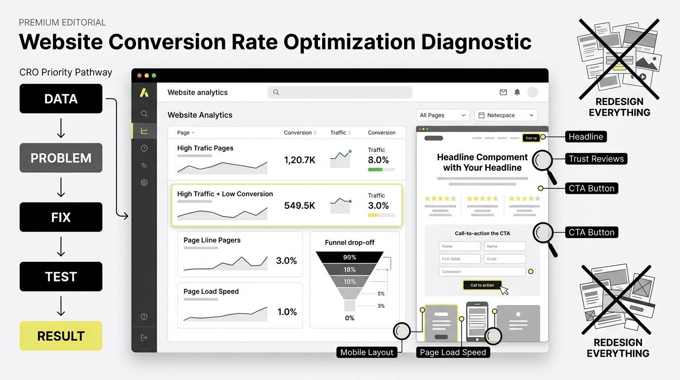
Start with the pages and steps closest to conversion. Check your analytics to identify high-traffic pages with low conversion rates, then investigate where visitors leave.
A practical CRO priority order is:
Define the conversion you want.
Measure the current conversion rate.
Identify high-intent pages and drop-off points.
Improve the value proposition.
Remove unnecessary friction.
Strengthen trust and proof.
Improve CTAs and forms.
Fix mobile and page-speed problems.
Test your changes.
Measure the results and repeat.
This approach prevents a common CRO mistake: spending weeks redesigning pages without knowing whether the original problem was actually design.
How Do You Calculate a Website's Conversion Rate?
The basic website conversion rate formula is: Conversion rate = conversions ÷ total visitors × 100
For example, if 5,000 visitors reach a landing page and 150 submit an enquiry, the conversion rate is 3%.
However, one website can have several conversion rates. An ecommerce store can track purchases, add-to-cart actions and checkout completion. A service website can track enquiries, consultation bookings and contact form submissions.
Choose the conversion that matters to the business before changing the page. Otherwise, you may optimise for clicks without improving actual business outcomes.
How Can You Improve the Value Proposition in Above the Fold?
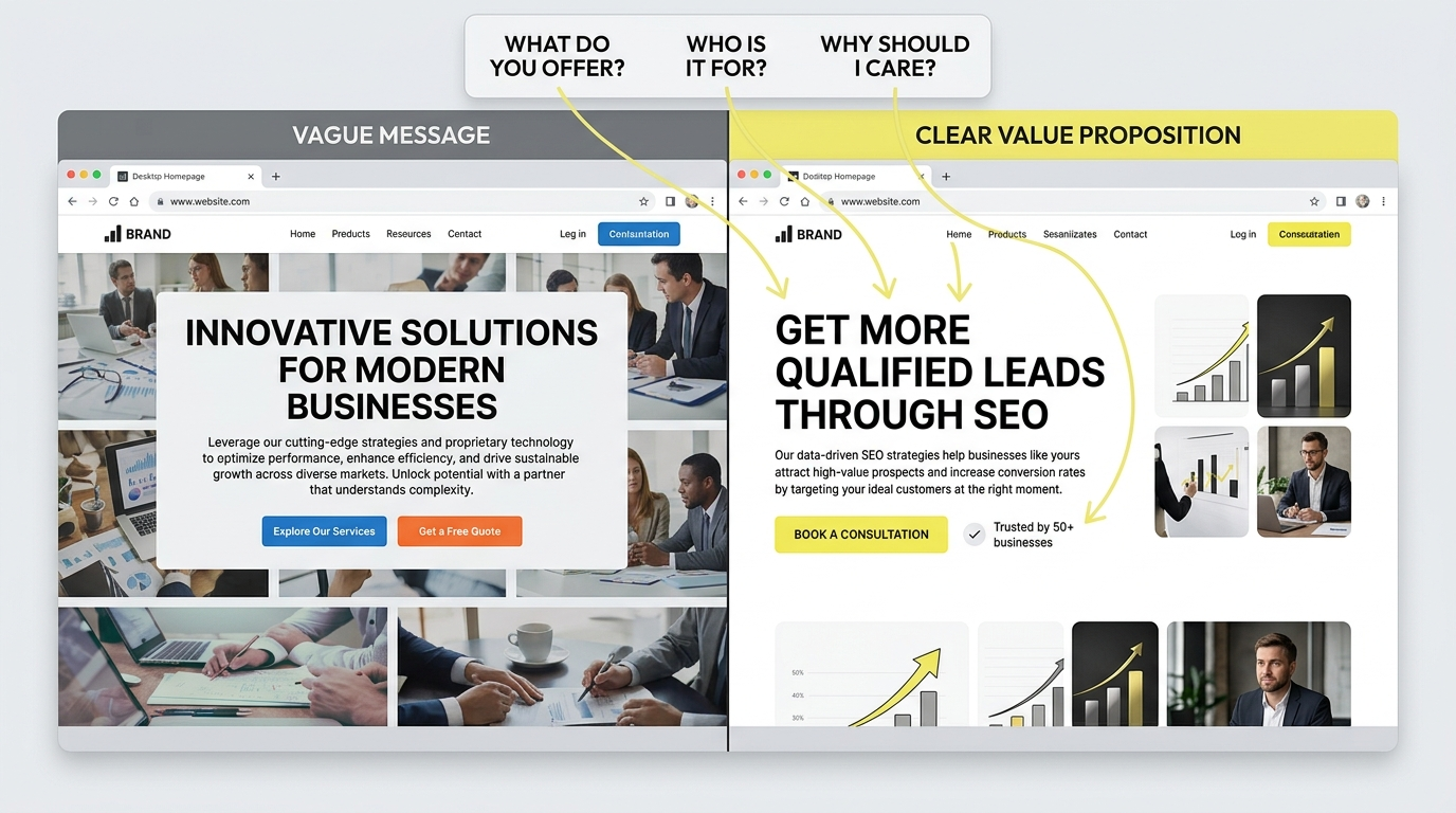
Your first screen should quickly answer three questions:
“What does the business offer? Who is it for? Why should the visitor care?”
Generic headlines often waste valuable space. A headline such as “Innovative Solutions for Modern Businesses” tells visitors almost nothing.
A stronger headline communicates the outcome or specific value.
For example, an online service provider could replace a vague headline with a direct statement that explains what the service does, who it helps and the main benefit.
The same principle applies across ecommerce, education, SaaS, healthcare, professional services and local businesses.
Use the first section to communicate:
The main customer problem
The product or service
A specific benefit
A relevant supporting proof point
One clear next step
Do not make visitors work to understand what you sell.
How does Matching Search Intent Improve Conversion Rate?
A visitor converts more easily when the landing page matches the reason they arrived.
Someone searching for a specific product or service is likely looking for information directly related to that offer, such as features, benefits, pricing, availability or a way to take the next step.
Likewise, someone searching for how to choose a product expects useful comparisons, selection criteria and relevant information rather than a long brand story.
Match the page to the visitor's intent.
Search intent | What the page should provide |
Informational | Clear explanation and useful guidance |
Commercial | Comparisons, benefits, reviews and proof |
Transactional | Product details, price, availability and CTA |
Local | Location, service area, contact information and trust |
B2B | Applications, specifications, process, proof and enquiry option |
This is where SEO and CRO work together. Ranking for the right query brings visitors whose expectations already match the page.
How Can You Reduce Friction on a Website?
Every unnecessary step creates another opportunity for a visitor to leave.
Look at your forms, navigation, checkout, pop-ups, account requirements and booking processes.
Ask:
Does the visitor need to create an account?
Are you asking for information you do not need yet?
Can the form be completed easily on mobile?
Is the CTA visible without excessive scrolling?
Are shipping charges or other costs revealed too late?
Does the checkout explain what happens next?
Are error messages clear?
Can visitors easily return to previous steps?
For ecommerce businesses, reducing checkout friction can therefore matter more than endlessly adjusting homepage design.
For example, if a customer has to create an account, complete several unnecessary fields and wait until the final step to see additional charges, each step can create another opportunity for abandonment.
How Can Social Proof Increase Website Conversions?
Visitors often need evidence before they trust a business.
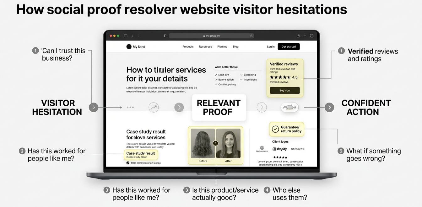
Useful proof includes:
Verified customer reviews
Case studies
Client logos
Ratings
Testimonials
Product demonstrations
Before-and-after examples
Industry certifications
Guarantees and return policies
Real customer results
Place proof close to the point where a visitor makes a decision.
For example, a product page can place reviews near the product details and CTA instead of hiding every review at the bottom. A service page can place a relevant case study close to its enquiry CTA.
These elements reduce unanswered questions at different stages of the buying journey.
The important point is not simply to “add testimonials”. Match each proof element to the hesitation it resolves.
How Should You Optimise Website CTAs?
A CTA should tell visitors what happens when they click.
“Submit” gives little information.
“Book a consultation” or “Request a call back” gives the visitor a clearer expectation.
Use one primary action for each page and support it with secondary options when necessary.
The CTA should also appear at logical decision points. A long service page should not make visitors return to the top just to enquire.
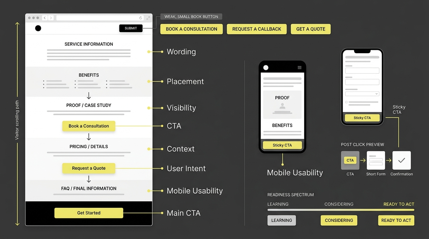
Good CTA optimisation considers:
Wording
Placement
Visibility
Context
User intent
Mobile usability
The next step after clicking
Do not assume a more aggressive CTA automatically performs better. The CTA needs to fit the visitor's readiness to buy.
A What is CTA in digital marketing article can help explain why CTA wording, placement and context matter when optimising a page.
How Can Website Forms be Optimised for More Conversions?
Forms should ask for enough information to move the conversation forward, not everything the sales team may eventually want to know.
For a simple enquiry, asking for name, email, phone number and message may be enough.
For a high-value commercial enquiry, additional information such as business type, location and specific requirements may genuinely help qualify the enquiry.
The right number of fields depends on the conversion and the value of the lead.
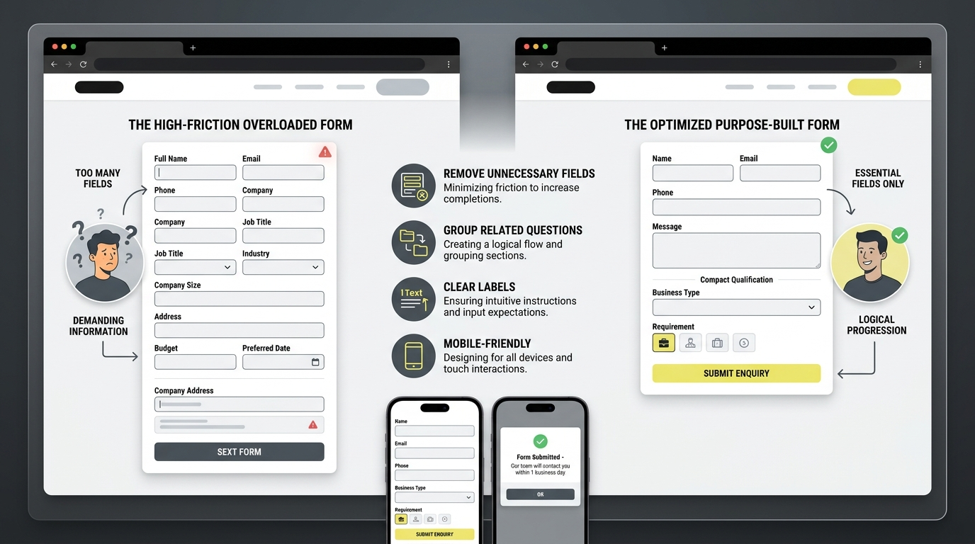
Improve forms by:
Removing unnecessary fields
Grouping related questions
Using clear field labels
Explaining required information
Showing useful error messages
Making fields easy to complete on mobile
Setting expectations about what happens after submission
For high-consideration purchases, the form can also explain what the visitor receives after submitting it.
How does Mobile UX affect Website Conversion Rate?
A website can look excellent on desktop and still lose conversions on mobile.
Check the complete conversion journey on an actual phone:
Landing page → navigation → product/service page → CTA → form/cart → payment or enquiry → confirmation
Look for tiny buttons, text that is difficult to read, intrusive pop-ups, slow-loading images, horizontal scrolling and forms that are painful to complete.
Google recommends monitoring Core Web Vitals, including LCP, INP and CLS, which measure loading performance, responsiveness and visual stability. Its current guidance recommends LCP within 2.5 seconds, INP below 200 milliseconds and CLS below 0.1 for a good user experience.
Do not treat these metrics as a magic ranking formula. They are useful indicators of whether the website is providing a smoother experience.
How Can Analytics Show Why Visitors Are Not Converting?
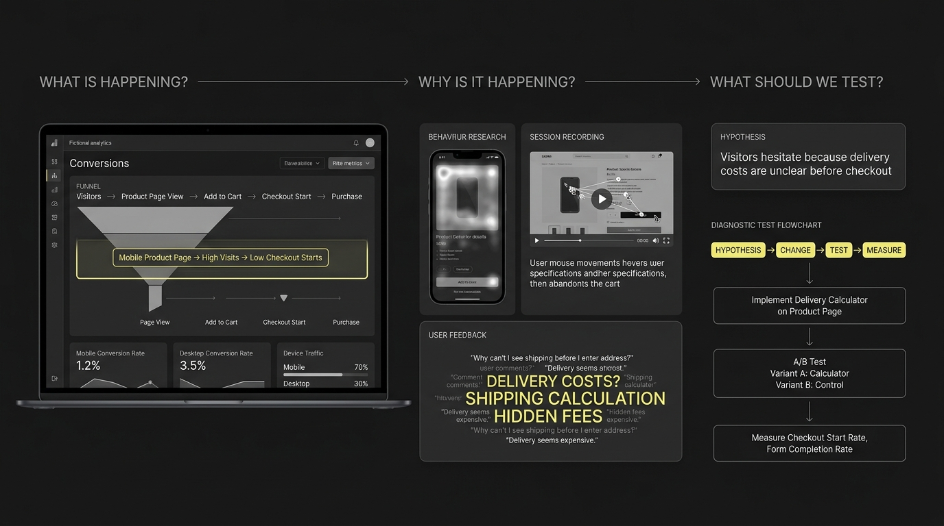
Analytics tells you what is happening. Behaviour research helps explain why.
Start by reviewing:
Conversion rate by landing page
Conversion rate by device
Traffic source
New versus returning visitors
Funnel drop-offs
Exit pages
Form abandonment
Checkout abandonment
Search queries
Campaign-level performance
Then use tools such as heatmaps, session recordings and user feedback to investigate unusual drop-offs.
For example, if mobile visitors reach a product page but rarely begin checkout, inspect that mobile journey before redesigning the entire website.
The goal is to turn “people are not converting” into a specific hypothesis such as:
Visitors understand the product but hesitate because delivery costs are unclear before checkout.
How Should You Use A/B testing to Improve Conversion Rate?
A/B testing compares two versions of a page or element against the same audience.
You might test:
Headline A versus headline B
Short form versus longer form
Product image versus product video
CTA wording A versus CTA wording B
Different checkout flows
Different value propositions
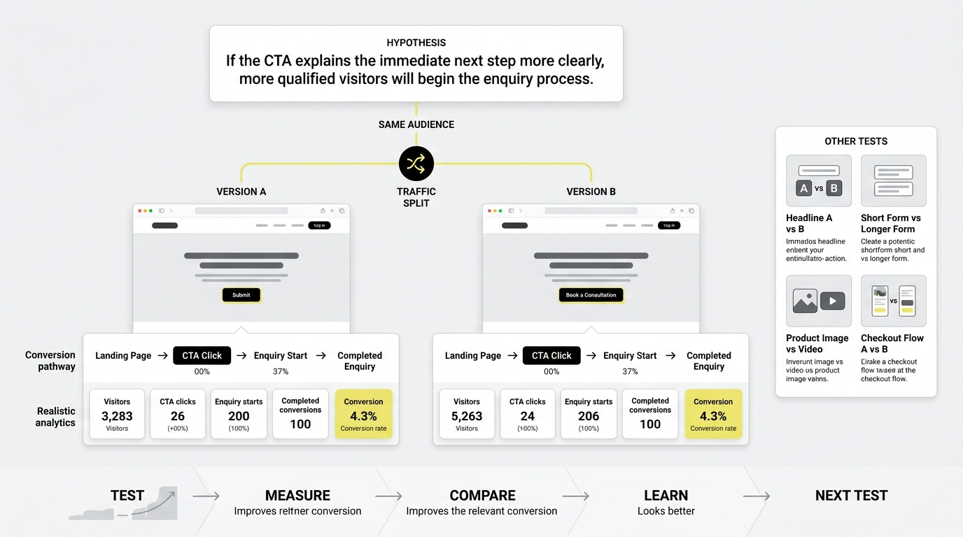
Start with a clear hypothesis. Instead of saying, “Change the button because it looks better,” define the expected behaviour:
If the CTA explains the immediate next step more clearly, more qualified visitors will begin the enquiry process.
Then measure the relevant conversion rather than judging the result visually.
Do not run a test simply because testing sounds sophisticated. Prioritise changes that affect meaningful traffic and business outcomes.
Which Website Pages Should You Optimise First?
Not every page deserves the same CRO effort.
Start with pages that combine high traffic, high commercial intent and visible conversion problems.
Page | What to review |
Homepage | Value proposition, navigation, primary CTA |
Product page | Benefits, price, reviews, delivery, CTA |
Service page | Problem, solution, proof, enquiry path |
Landing page | Intent match, message, CTA, friction |
Pricing page | Clarity, comparison, objections |
Cart | Costs, trust, delivery and edit options |
Checkout | Fields, account creation, errors and payment |
Contact page | Form length, trust and response expectations |
How can You Build Trust before Asking Visitors to convert?
Conversion often depends on unanswered questions.
A visitor may wonder:
Is this company legitimate?
Is the product suitable for my needs?
How long will it last?
What happens if I change my mind?
Can I customise the service or product?
Is there support after purchase?
Does the company work with businesses or customers like me?
Answer these questions before the visitor has to ask.
The exact questions depend on the product, service and level of commitment involved.
What is the Biggest Mistake Businesses make with CRO?
The biggest mistake is treating conversion optimisation as a collection of isolated design tricks.
Changing a button colour may help in a particular context. Shortening a form may help. Adding a testimonial may help.
But none of these changes automatically solves a conversion problem.
If the visitor has the wrong offer, unclear pricing, weak product information or no reason to trust the business, a prettier button will not fix the underlying issue.
CRO works better as a cycle:
Measure → Understand → Hypothesise → Test → Learn → Improve
This makes every change accountable to evidence.
How Can a Business Create a Practical CRO Plan?
Start with one important conversion and one high-value page.
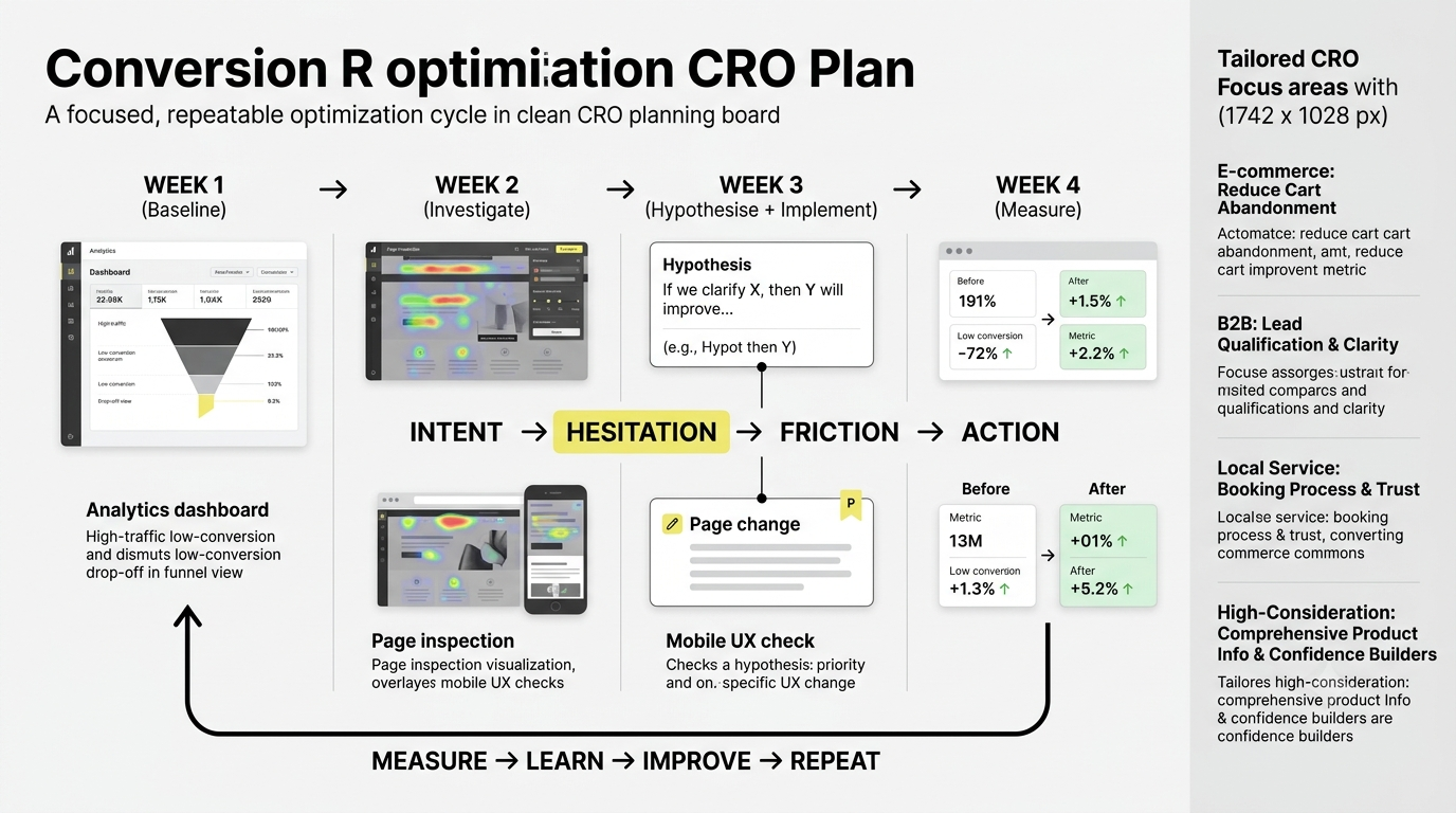
Week 1: Establish the baseline and identify the largest drop-off.
Week 2: Review user behaviour, page content, forms, mobile UX and trust signals.
Week 3: Create one or two evidence-based hypotheses and implement the highest-priority change.
Week 4: Measure the result and decide whether to keep, modify or reject the change.
Then repeat the process.
For businesses with ecommerce, B2B, local-service or high-consideration websites, the exact CRO priorities differ. An online store may need checkout optimisation, while a B2B company may need clearer service positioning and stronger case studies.
The principle stays the same: find the point where intent turns into hesitation, then make that step clearer and easier.
How can CRO support SEO and Digital Marketing?
SEO brings qualified visitors to a website. CRO helps the website make better use of that traffic.
That makes conversion optimisation particularly important when a business is already investing in:
SEO
Google Ads
Social media advertising
Content marketing
Email marketing
Influencer campaigns
Organic search
Increasing traffic while leaving conversion problems untouched can simply send more people into the same leaky funnel. Understanding how visitors move through each stage is also important, which is where a Sales Funnel in Digital Marketing approach can help.
Google also recommends providing a good overall page experience, including mobile usability, secure pages, good Core Web Vitals and content that visitors can use easily.
That is where SEO, UX, content and CRO meet.
Conclusion
Improving a website's conversion rate is not about making random design changes or adding more CTAs. It starts with understanding what visitors need, where they hesitate and what prevents them from taking the next step. From clearer messaging and stronger trust signals to better forms, mobile UX, search intent and A/B testing, every improvement should be based on real user behaviour and measurable results.
CRO also shows why digital marketing cannot be treated as separate channels. SEO may bring visitors to your website, content can answer their questions, social media can build awareness, and paid campaigns can generate targeted traffic. But the website still needs to turn that interest into meaningful action.
If you want to build a career in SEO, social media, paid advertising, content marketing and other areas of digital marketing, learning how these channels work together is an important first step. A structured digital marketing course can help you develop practical skills and understand how marketing strategies are planned, executed and measured.
And if you're looking to start or grow your career in digital marketing, explore HACA’s digital marketing course in Kerala that gives you practical exposure to real projects, current marketing tools and different digital channels.